Enhance Your Website’s Readability with This Simple Contrast Tip
When it comes to creating a great user experience on your website, one thing is often overlooked: the contrast between your background color and text. But it’s more important than you think!
Good contrast ensures that your text is easy to read, keeping visitors engaged and more likely to take action. On the other hand, poor contrast can make your text hard to read, causing frustration and leading people to leave your page.
Why It Matters
When your site is hard to read, you’re essentially asking your visitors to work harder than necessary—and let’s be honest, no one wants to do that! A poor user experience can mean missed opportunities, as visitors may leave and never return.
Action Step
Here’s what you should do: Go back and review your website or sales page. Make sure the contrast between your background color and text is strong enough in every section. If it’s not, adjust it to improve readability.
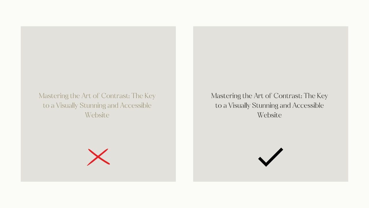
Example of Good and Bad Contrast:

Making this small adjustment can significantly enhance the user experience and ensure your visitors stay longer and engage with your content.
By improving readability, you reduce friction for your audience, helping to boost conversions and keep potential customers on your site.