

Why the Colour Scheme of your Sales Page is More Important Than You Think
Sometimes all you need is a pop of colour and everything comes to life.
Colours please everyone. And they impact in ways that are unknown to you! There’s no place where one can say that “no, colours aren’t making a difference”.
When you visualize your sales page, what comes to mind? High converting copy? Beautiful Design.
No doubt all these elements are essential, but there is something equally important which is the COLOUR SCHEME.
Colours have a big role to play on a sales page and I am so excited to talk about it!
Let’s dive in!
There are three ways in which the colour scheme is related to your sales page -

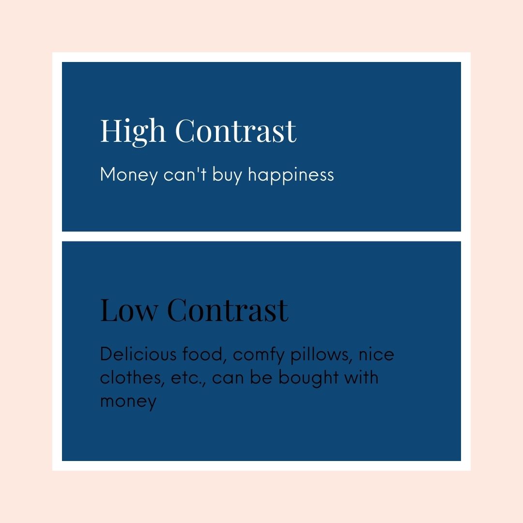
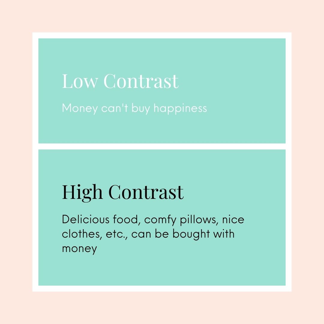
READABILITY
When I say colour enhances readability, I mean that text is more readable when they’re placed on a contrasting background.
Below are some examples to show what I mean.
 .
. 
Psychological effect
If you have not chosen your brand colours, let me take you through the purpose of each colour. This way you’ll know what a colour can do for you and you can choose a colour based on your goals.
Colours stir up emotions, different colours trigger different emotions.
Studies conducted by psychologists have found that colour impacts the assessment of a product or service by a shocking 62-90%! (Source- Researchgate)

RED- Red stands for boldness and excitement. It fuels a person’s hunger to go get it! So red colour is perfect for a flash sale button. It pops and grabs attention before anything else because it’s so vibrant and OUT THERE.
BLACK-Black is CLASSIC. It shows sophistication and power. It is the most used colour for texts and makes everything stand class apart.
I do like black text most time.
There is nothing that doesn’t look good in black- clothes? Yes. Shoes? Yes. Denim? BIG YES. Black is exclusive and adds value to your sales page.
BLUE-Blue is evergreen. Blue is the most preferred colour on the sales page. Plus colour establishes trust.
This colour is used a lot by companies in the financial space.
PURPLE- Purple is associated with royalty and wisdom. It’s a great colour to choose if your target audience is women because it is HIGHLY preferred by females!
The colour looks so soothing and promising, adding to the trustworthiness of your service.
It is commonly used for people in the spiritual niche. Coz it has a zen-like feel to it.
GREEN- One of the most relaxing colours that there are. It is easy for our eyes to adjust to this colour. It is such a refreshing colour and denotes nothing else but health, restoration, and the environment of course.
It is a colour used by folks in the health and wellness space.
ORANGE-Orange is a warm tone colour and stands for WARMTH. Easy to remember, right?
It also conveys friendliness and fun, with so many uses of this colour.
YELLOW- Undoubtedly the happiest colour!! Even happier than a blooming sunflower! Yellow conveys (and also spreads☺) happiness and optimism.
No one can go wrong with yellow.
Yellow should never be your font colour, it is a tad bit hard to read. But don’t worry, because for the font you have black☺
Helps in setting the vibe of your page
While choosing your colours, Always ask yourself, does this match the vibe I want to create.
When we talk of vibe we must understand that soo many things together decide the vibe of your sales page.
Your personality, the topic of your course, your target audience- everything plays a part somewhere to determine the vibe of your page.
Let’s understand this with some examples- If you’re offering a course on how to manage grief- do you think it’d be wise to use a vibrant colour like pink? No, right?
And what if you’re considering joining a corporate training course, would you still consider it if it’s bright green?
Some colours are bold and out there, and don’t suit everywhere… that’s what we need to understand.
While selecting colours, think about your target audience too. You can’t be having a bubble gum pink sales page if you have an older audience or a male demographic.
It won’t talk to your target audience. Because they’ll feel it is not for them.
The bottom line is, that the vibe of your sales page must match the vibe of your target audience so that they can relate to it.
So here, let me give you some tips on how to TRY and NOT go overboard!
1 )The primary problem with choosing too many colours to make it extra colourful is that you lose the professional touch.
Note:
7 colours suit only on a rainbow, not on your sales page.
1 ) So to make it look pleasing to the eye, don’t use a lot of colours.
2) Use an eye-catching colour on the CTA button, it just POPS and grabs attention like crazy!
3) I Prefer using black for text, it enhances readability. If the background is dark use white for the font colour.
Think it through, and make smart choices. With colour, its EFFECTIVENESS is EVERYTHING.
Since there are only a few elements that can transform your visitor into a customer, it is important to ensure all those elements are chosen right.
Other blogs regarding sales pages design:
6 simple tips to design a high-converting sales page
Top 5 Reasons to Use Sales Page Templates When Trying To Build A Sales Page


