
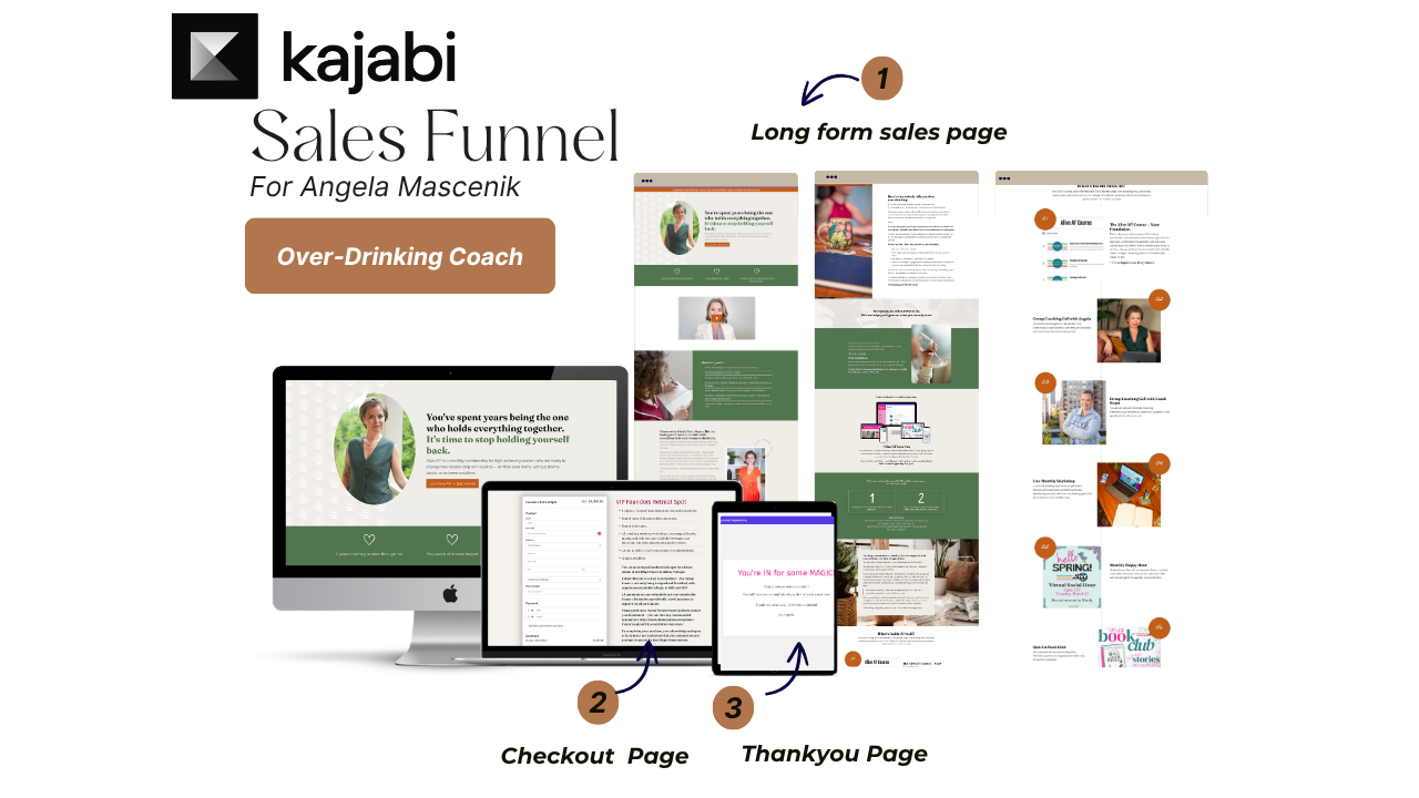
Kajabi Membership Sales Page Design for Angela Mascenik — Alive AF!
Angela Mascenik is a certified alcohol-free life coach who has spent eight years helping high-achieving women change their relationship with alcohol — without shame, labels, or all-or-nothing pressure.
Her membership, Alive AF!, is for women who are successful, high-functioning, and privately exhausted by a drinking cycle they can't seem to break on their own. They don't relate to rock-bottom stories. They don't want a programme that talks about recovery. They want a way out that feels like them.
This was Angela's second project with me. She already knew what to expect. This time, she came with a new brand identity and a clear goal: a full Kajabi sales page, designed and built for her membership launch.
Meet the Client
Angela has been coaching women for eight years. She has built a practice from the ground up — nearly 400 podcast episodes, multiple courses and programmes, in-person sober retreats, and her own retreat centre in Lisbon, Portugal.
She is not a traditional recovery coach. Her approach is rooted in understanding why you drink — the patterns, the emotions, the automatic responses — and working with that, not against it. That is what makes Alive AF! different from everything else in the market.
And that difference needed to come through on the page.
The Challenge: Designing a Sales Page for a Private, Sceptical Audience
A membership sales page for a sensitive coaching category is not the same as a regular offer page. You cannot design it the same way.
The women Angela serves are not looking for a programme that leads with fear or shame. They have already tried cutting back. They have done Dry January and downloaded the apps. What they want is to feel understood — before they are asked to do anything.
That changes everything about how the page is structured. What goes first. What follows. Where the CTA sits. How social proof is framed. How the membership is introduced without pressure. A generic layout would not work here. The design had to do specific emotional work, section by section.
On top of that, Angela had a fresh brand identity she wanted the page to reflect. New visual direction, new feel — and it needed to be incorporated throughout her new sales page.
How I Approached This Project
Before I open Kajabi, I need to understand two things: who the audience is and who the founder is.
That means going beyond the surface. Not just who the reader is, but where they are in their decision. What they have already tried. What needs to be true on the page for them to say yes.
And it means understanding the founder — the brand, the tone, the feeling they want to create. If there is an existing page, I look at that too. What is working, what is not, what the page is doing that it should not be.
For this project, Angela brought her new brand identity with her. My job was to take that and make the page feel like a natural extension of it — not a separate thing sitting next to it.
She had zero revisions.
That is not luck. That is what happens when the brief is done properly. When you ask the right questions and really listen to the answers, the first version lands.
What I Designed and Built
Section Architecture Built Around the Reader's Journey
The section order on a membership sales page matters more than most people realise. A page that leads with features before the reader feels understood will underperform — every time.
For Alive AF!, the page opens with a mirror moment — something the reader immediately recognises as her own experience. Then it moves into the problem, the mechanism, the offer, and the close. Each section does a specific job. Nothing is there to fill space.
New Brand Identity Translated Into the Page
Angela came with a fresh brand direction — new typography, new colour palette, new visual tone. My job was to make the sales page feel like it was always part of that identity. Fonts, colours, spacing, imagery placement — all of it built to match the brand.
Social Proof at the Right Moments
The testimonials are placed at the moments in the scroll where the reader is closest to a decision — not just at the bottom as an afterthought. Clean, easy to read, and the results speak without overselling.
CTA Strategy
There are multiple CTAs on the page, each positioned based on where the reader is emotionally at that point in the scroll. The goal is never to push. It is to be there when the reader is ready.
FAQ Built Around Real Objections
The FAQ section addresses exactly what this audience worries about — privacy, camera, cancellation, how the calls work. Every question came from a real place.
Mobile-Responsive Build
The page was reviewed and adjusted across breakpoints. What reads well on desktop has to land the same way on a phone.
Why a Membership Sales Page Is Different to Design
A membership page is not selling a one-time outcome. It is selling ongoing belonging.
That changes the emotional work the page has to do. It is not enough to show what is inside. You have to show what it feels like to be a member — the community, the continuity, the sense of being in the right room.
For Angela's audience specifically, that sense of being in the right room is everything. These are women who have felt alone in this for years. The page has to make them feel like the community already understands them before they even join.
I have written about the full framework behind this here:
- 6 Must-Have Sections for a High-Converting Membership Sales Page
- Course Sales Pages vs. Membership Sales Pages — Key Differences
What This Means If You Are a Coach With a Membership
A membership sales page is one of the most important pages you will build for your business. It is not just a place to list what is inside. It is the page that convinces someone to commit to a recurring investment — month after month.
Getting the design right matters. Getting the section order right matters. Understanding your audience well enough to know what they need to read, in what order, at what emotional moment — that is the work.
I have been designing Kajabi pages for coaches and course creators for nearly a decade. If you have a membership and want a page that actually converts, let's talk.
Book a call and let's talk about your project →
Frequently Asked Questions
What does a Kajabi membership sales page designer do?
I design and build the full page inside your Kajabi account — layout, section structure, visual design, CTA placement, and mobile responsiveness. The goal is a page that feels like your brand and is set up to convert.
Do I need copy ready before we start?
Ideally yes. Copy should come before design. If you don't have copy yet, I provide a membership sales page framework that shows you exactly what to write in each section. Additional support is available as a separate service if needed.
What kind of coaches do you design Kajabi sales pages for?
I work with coaches, consultants, and course creators globally who are selling memberships and programmes on Kajabi. I have particular experience designing pages for US-based coaching brands where the audience is specific and the messaging needs to do careful work.
How do you make sure the page feels like my brand?
I ask detailed questions before I design anything — your brand, your audience, your goals, what you want the page to feel like. When you bring a brand identity to the project, I build the page as a direct extension of it.
How long does a Kajabi membership sales page project take?
Usually 1–3 weeks depending on scope and how quickly assets come through. Repeat clients move faster.
What actually makes a membership sales page convert?
Section order matters more than most people think. The pages that convert mirror the reader's situation first, explain why what they have tried has not worked, and then introduce the offer. I have been building this structure into membership pages for nearly a decade.
If you have a Kajabi membership or programme you're ready to launch — or a page that's not converting the way it should — let's talk.
I'll look at what you have, understand what you're building, and tell you honestly what the page needs.


